When designing web sites, especially minimalist sites, typography is a big thing. So inevitably the question arises: What is the most minimalist typeface? And right after: Can it even be said that some typefaces are more minimalist than others?
Three possible answers:
Each of these are true. The last one is the least interesting in this context of course, and I’ll leave that one for what it is. I’ll elaborate on the first two with some examples.
Bradford Ulrich, a webdesigner from Oklahoma, U.S.A., tried to cut out the unnecessary parts of the letters while still keeping them legible:

Somewhat similarly, the typeface below is a study of how much (or how little) of each letter is needed for legibility. It’s called FF You Can (Read Me) and was designed by Phil Baines.
It is for download at FontFont.


Both of these are truly minimalist exercises – but you will probably agree: the results looks gimmicky.
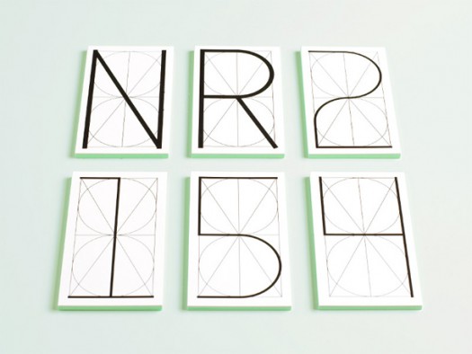
NR2154, a multidisciplinary design studio based in Copenhagen and New York, designed their personal visual identity around a typeface built up from two circles, two squares and two diagonals.

But you could go even further and ditch the circles and diagonals. Doing that will get you somewhere close to Flat10 Segments. Segments is an 8-bit pixel font designed by Ryoichi Tsunekawa out of respect for 80s game designers and the pixel font pioneers in middle 90s.

![]()
![]()
In some letters, such as the Y and the Z, you have to sacifice legibility.
This is (of course) the conclusion: each typeface is a symbol with its own elegance. Minimalist web design is not so much about the character of the typefaces you use, but rather about how few different typefaces you use, and in the minimal variation of sizes and weights.